
WHAT’S THIS CASE STUDY ABOUT?
The School District of Philadelphia enlisted Philly Truce to help expand their Safe Path Program. Philly Truce partnered with Tech Fleet to provide a digital solution to the Safe Path Program’s current paper-based incident management system. Tech Fleet recruited a group of 20 volunteers to help execute this project.
OUR MAIN PLAYERS


Click on a pic to learn more about our key stakeholders!

3 CHALLENGES FOR EXPANDING THE SAFE PATH PROGRAM
1
2
3
Currently, Safe Path Monitors document observed incidents using a paper-based incident report at the end of their shift.
While deployed, Safe Path Monitors do not have a means of collaborating with other Safe Path Monitors in real-time.
The Safe Path Program does not currently provide a remote way for students and community members to report incidents they observe.

INITIAL CONSTRAINTS
Only 8 weeks to develop a MVP as Philly Truce was presenting to the school board at the end of the year to attempt to secure partnership.
No budget! Nada! Niente!
Because everyone was volunteering from across the globe there was an array of limited schedules and time availability.
MY ROLE
After spending over a year immersed in UX Design and Research, I wanted to utilize my decade of experience as a professional screenwriter and understand the role of UX Writers in a little more detail. Also, having been a teacher myself, I was excited to contribute in any way to the betterment of the education system. I was initially one of three UX Writing leads managing three apprentice writers, but because of scheduling conflicts, I eventually became the sole lead.
Some of my duties included:

Creating and documenting weekly meeting agendas
Attending and presenting weekly progress reports at all-hands meetings
Organizing team Figjams and delegating async assignments
Attending and contributing to weekly UX Research meetings and reporting back to UXW
Developing a working Voice + Tone document as well as contributing to comprehensive research and zero-hour feature additions
Making a final presentation to all key stakeholders on UX Writing’s contributions
Organizing and creating all hand-off documents

Immediate Struggles
After the first week, it became clear that there wasn’t a strong centralized presence leading the project. Because of this, individual teams started moving forward with their initial scopes without much interaction with each other.
Team Leads Unite!
After two weeks of confusion about the actual scope of the project, UX Research, Design, and Writing leads decided to meet and get on the same page. This led to more open communication, clearer understanding of what everyone was working on, and a “what do you need from us” approach to cross-collaboration. This meeting was eventually turned into a weekly all-hands meeting after Project Management, Project Strategy, and the Founders started to join.

SCOPE CHANGE
Within the first few weeks, the Founders thought it was important to add a feature to the incident management system where students would be able to anonymously report an incident or potential incident so that Safe Path Monitors could resolve and prevent issues in real time. Specifically, creating a chatbot that would be able to respond immediately to students and ask for the pertinent information to be transferred to SPMs. This opened up a whole new can of worms and challenges.
Adding a completely new user demographic...
STUDENTS
Insert RECORD SCRATCH sound here
PROBLEM: Who to focus on?
Safe Path Monitors or Students?
Incident Management System or Chatbot?
We decided that whether we were creating microcopy for the incident management system or creating an automated response chatbot for students, we needed a unified voice of the product to represent these features.
But to figure out the voice of the product…
We needed to RESEARCH!
PARTNERING WITH UX RESEARCH
As the Research Liaison, I attended all weekly research team meetings where I was welcomed to contribute and share my thoughts, not just from a content perspective, but holistically as well. Throughout the project, especially in the initial weeks, Writing worked with Research closely and collaboratively.

Using Competitive Analysis & Content Analysis
The UX Research team conducted an in-depth competitive analysis on 8 apps and websites that focused on crime reporting and teen support. The Writing team thought it was best to do further content analysis of these sites to help give us some direction with tone.

WHAT DID WE LEARN?
Analysis + UXR Notes + Recommendations
Many sites aimed at teens seemed to be super word-heavy; using pictures and videos wherever possible to convey information was welcomed.
Many of the teen sites were written by adults, as there was a disconnect in language and enticing content.
Warm, empathetic, and honest language felt more on point compared to copy that was trying to be hip or use grave or overly-serious language.
CLICK and learn how our interview with a trauma therapist helped guide our trauma-based approach to language.

CLICK for some “Aha” moments into UX problem solving and insights into AI Chatbots, as I volunteered for 4Cups.
A Major Conclusion

UXR’s Recommendations & Addendums
=
+

Therapist Takeaways
TRUST

+
Takeaways from 7Cups & Chatbot
If we want Students to use Philly Truce, they need to trust Philly Truce
There needed to be reassurance that:
They could stay anonymous and not be perceived as a snitch
Their issue would be taken seriously
They would be acknowledged/heard
Someone would help them
+

User Interviews Report
SYNTHESIZING RESEARCH

Content Analysis of over 8 apps/websites
+
HOW TO BUILD TRUST WITH LANGUAGE
How do we build trust with young students who are weary of authority, in an elevated, traumatic environment, and are fearful of being seen as a snitch and the possible repercussions that would come along with that?
I organized a Figjam session where we used our research and takeaways to brainstorm words that would reflect the voice and tone of this product. We focused on efficiency over unnecessary deliberation, which enabled us to quickly build a working voice and tone document. This was used as a guide when developing the language used for our automatic response chatbot.
VOICE + TONE

VOICE is our personality. It’s how we talk, what we talk about, how we come across. Voice is consistent.
Words we used to guide our voice:
UNDERSTANDING
SUPPORTIVE
OPTIMISTIC
TRANSPARENT

TONE is the emotional state of our voice. Tone is variable, depending on many factors: who our audience is, where they are in their user journey, the subject matter, the circumstance, etc. It’s our mood.
Casual, conversational
Serious but not grave, the incident is taken seriously
Respectful, do not talk down to young users
Matter-of-fact, but warm
Not authority, not friend - more reassuring mentor
Factual - unbiased, non-judgmental
Tone to guide our conversations:
AUTOMATED RESPONSE CHATBOT
It was determined that using an automated response system was a more efficient way for students to quickly report an incident in case a Safe Path Monitor (SPM) was temporarily unavailable. Design provided a template and flow of the automated response process, and the necessary info to be recorded and transferred to an information management system.
Required info needed for the SPM Dashboard to document the incident:
Name of the closest school
Approximate Day/Time of Event
Option to speak to SPM
Permission for SPM to follow up
How do we ask for this information as quickly and easily as possible while reassuring a vulnerable student?
Do we need all the required prompts, or is this an unrealistic amount of information to be asking a vulnerable student?


Disagreement of the Century*: Design vs. Writing
*a cordial and productive momentary impasse
After creating a working prototype of the Automatic Response Chatbot, UXW still felt that the flow was clunky and unrealistic.
Design insisted on a prompt asking permission for the student’s consent (so that a SPA could follow up with them), to respect a student’s boundaries.
The Writers agreed with this thoughtful step, however, our research suggested that for the very few students who would use this function (ie, get over the fear of being a snitch), they would want to do so as fast as possible with limited questions and friction.
Therefore, Writing pushed back to scale down the requirements to only vital information that would be transferred to the SPM dashboard.
The Founders Decide
Ultimately, after an all-hands meeting, Mazzie and Steven weighed in and agreed with the writing team - shorter is better.
“The most realistic scenario would be that a student drops a quick ‘heads up’ and then ghosts the response.” -Mazzie
It was decided that for future phases, it was best for the chatbot to present only two questions:
What school is closest to the incident (to ping the appropriate SPM)?
When did / will the incident happen?
We could ruminate on details and propose hypotheticals all day, but testing will be needed in Phase 2 to confirm and refine the current flow.
OPERATION: MICROCOPY
Safe Path Monitor Dashboard
Onboarding + Documenting Initial Incidents
Spoiler: Over 90% of UXW’s 40+ suggestions were implemented!
Design delivered over 50 pages of mockups for a mobile version of the incident management system, including sign-up and onboarding functions. UX Writing spent a couple of days noting various copy via prototypes, focusing on a consistent tone while keeping the end user’s perspective at the forefront.


*** I tried to upload a 27MB PDF of every mockup with UXW notes, and a side-by-side, before and after comparison of all 40 pages… but I broke the internet. So please click on a picture and be magically whisked away to John Parr’s Man in Motion. ***
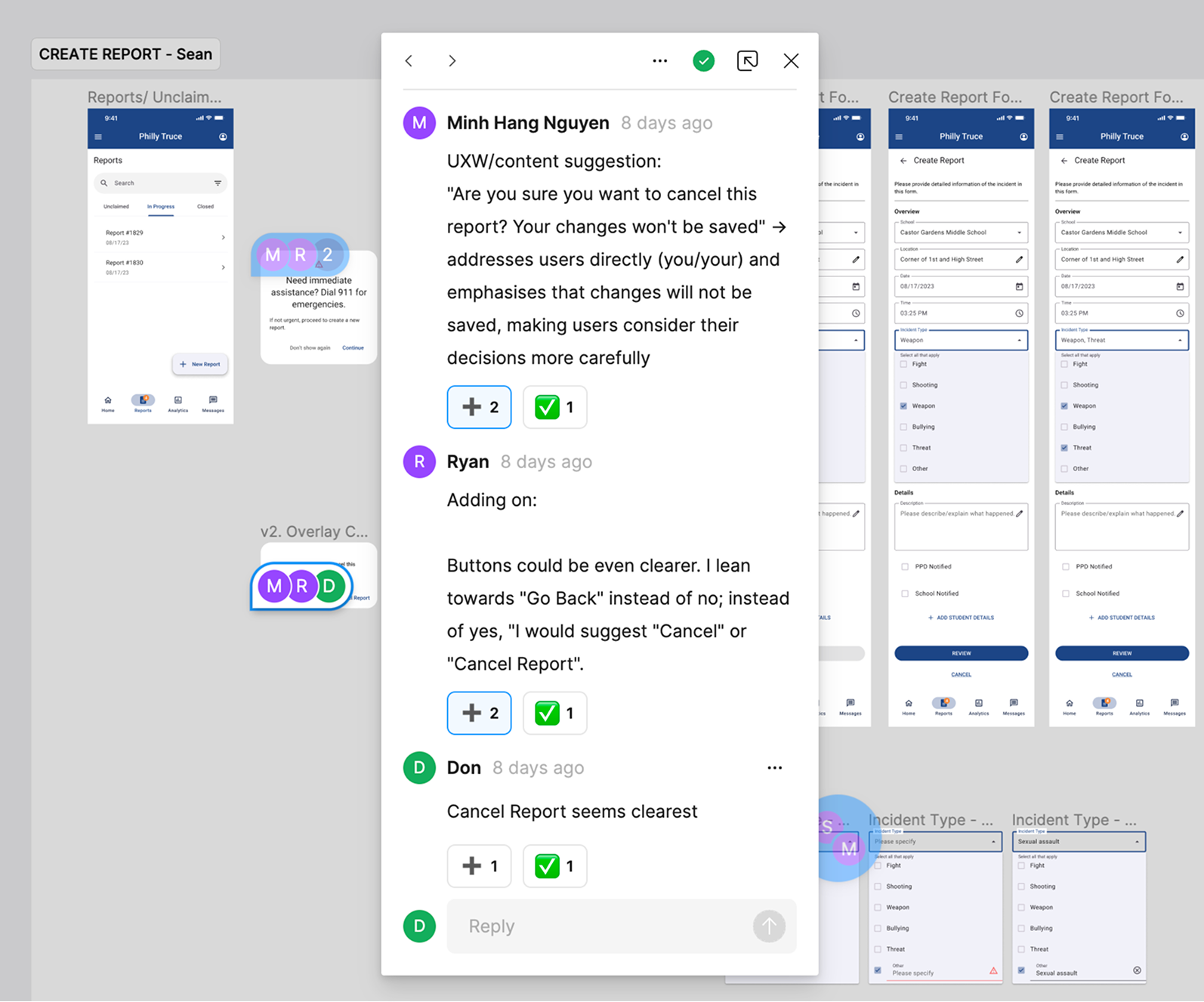
UXW went page by page, giving notes based on our Voice & Tone guides
Another example of making the copy warmer and more encouraging for Safe Path Monitors.:
BEFORE
You’re performing 5% slower than school average. Keep trying to respond to incidents in a timely manner.
AFTER
You're only 5% away from meeting our school goal of an 8 minute average response time! Keep up the good work -- when it comes to youth violence, every minute counts!


—>
Often our notes were to make directions, warmer, clearer, and more appreciative of the SPM’s

—>
Changing the title from “Overview” to “Average Resolution Times” also provided the graph with more clarity.
We suggested changing the hierarchy of the status message, as it was the most important information an SPM would read when entering the Analytics Page.
I will not be posting every updated page, but I will reiterate that over 90% of UXW’s 40+ suggestions were implemented by the Design Team
Phase 2 Recommendations + Handoff Documents + Presentation
My final tasks as UXW Lead were to create handoff documents for Phase 2, which included our progress and suggestions, and to present the same information to the Philly Truce founders, Mazzie and Steven.
Here were some of our recommendations for the next phase:
Exploring if two tones/voices are needed to differentiate the Automated Response bot when retrieving tips and the rest of Philly Truce.
Tone specifics – ie, tone for specific tasks and situations.
Style guidelines — ie, headings/subheadings rules for casing, tooltip casing, punctuation and grammar rules, question marks, date and currency formats, active voice etc.
Key vocabulary definitions — defining important terminology for Philly Truce, important community-specific terminology, etc. for future writers/designers.
Testing! Team with Research and A/B test content choices to see what potential users identify with most.
Review and further refine UX copy and content across pages and iterate on prototypes based on user feedback and content guidelines
If the project scope for future phases involves creating a larger and gamified app, consider
Designing login/sign up for different target groups, ie, students vs SPMs
Include onboarding slides introducing the app's benefits to build trust, especially among students, to motivate them to use the app
Collaborating with UXD to create a cohesive brand identity, referring back to previous work done on moodboards, colors, and related elements
Using content frames to structure content across pages, ensuring a clear content hierarchy tailored for target groups
Make SPM’s visual and state like/function to connect with a user directly.
Collaborate with other UX teams from the start to ensure alignment
It may not be for this particular feature, but a sitewide content audit of Philly Truce is necessary to consolidate, update, and unify content
PRESENTING TO THE FOUNDERS AND OTHER KEY STAKEHOLDERS

The project concluded with a final presentation to all key stakeholders of Philly Truce, including the founders, Mazie and Steven.
Our 25-minute presentation covered:
Our general approach
Our collaboration and takeaways from research
The importance of trust
A voice and tone breakdown with reasoning
Examples and approach for the automated response chatbot
An overview of our copy recommendations for UXD’s dashboard prototype
Brief recommendations for Phase 2
FINAL THOUGHTS
WHAT I AM PROUD OF
Stepping up to take on the Lead UX Role early in the project.
Helping to organize a team lead meeting to make sure we were all on the same page and working in unison.
Collaborating with the UX Research team throughout the entirety of Phase 1 and applying the findings to our writing.
Volunteering for 7Cups and gaining hands-on experience guiding those in need.
Received encouraging and positive feedback from my apprentices, fellow team leads, the project manager, and the founders of Philly Truce.
Successfully guided my team through the various last-minute changes in scope.
Having over 90% of our teams copy suggestions implemented by the UXD team for their final dashboard prototype.
Being part of a project that helps mitigate gun violence for at-risk youth.

This was ultimately a rewarding project to volunteer for, and I was grateful for the dedicated and highly collaborative teams I worked with, especially my talented apprentices. Phase 1 was more of a trial-and-error phase, as the scope and deliverables often changed, but it was amazing to see what was accomplished in 8 weeks when all teams were focused on a common goal. I’m happy to answer questions you have about the project! Thanks for checking it out!
WHAT I WOULD DO DIFFERENTLY
Reach out to the founders earlier with questions. I was unsure of the boundaries of communication at first and wanted to respect authority. But once I got more comfortable presenting to Mazie and Steven every week, I started to reach out directly for quick clarifications and questions, which sped up my team’s process.
Encouraged the UXW team to join me at UXR meetings. Yes, I was the liaison and did a decent enough job sharing the research data for our writing purposes, but I think my team would have had a better holistic understanding of the key takeaways by immersing themselves in the research process.
Collaborated with UXD earlier in the process. My apprentice, Mihn Hang, did an excellent job as UXD liaison, but I should have attended a meeting or two myself to get an idea of their progress with the SPM dashboard. I think we would have been in a better position as a team to address their needs and could have taken a bit more time with our suggestions.
Spent more time researching Voice and Tone - Our team was dedicated to assisting the research team, performing content analysis on various websites and apps, but I think I should have put aside more time researching voice and tone documents earlier in the process. My apprentice, Ryan, suggested we study the Style Guide for Mailchimp, which helped guide us with our own Voice and Tone document, but I would have loved to research more comparable guides to our product.